top of page
Infographic: The Sound of My Fall
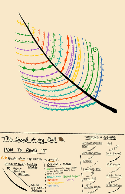
Inspired by Dear Data by Giorgia Lupi, U created a personal infographic of my fall playlist as an abstract artwork. Rather than striving for simplicity or immediate legibility, I wanted to challenge conventional expectations of infographics. I believe data visualization can also be poetic and something that invites curiosity and interpretation. Each color, pattern, and mark represents a different aspect of my listening experience, but their meanings are intentionally hidden without the key. This encourages viewers to slow down and explore the logic behind the design.
bottom of page