Cooper
Designing a Student
Co-op Review Platform
Part of a team of 3 designers, 4 developers, and 1 project lead at Sandbox tasked with building Cooper, a student-driven co-op review platform where users can explore co-op reviews from past employed students to make informed job decisions.
As a UI/UX designer, I’ve been designing the search flow to improve navigation and enhance the overall user experience. I’m conducting user research and iterating on designs to refine the platform.
UI/UX Desktop
Web Platform
Information Architecture
Timeline
September 2025 - Present
Role
UI/UX Designer
Tools
Figma
Github
Organization
Sandbox


The Problem
The current Cooper platform doesn't have a way for users to filter through different job listings and match their preference.
When I joined Cooper, the team was exploring a three-panel layout, with the third panel intended to serve as a filter bar. Since the concept was still in its early stages, I was tasked with iterating on this design to enhance the overall search experience and make it more intuitive in guiding users seamlessly through the platform.
Research
Top Filters vs. Side Filters?
Top filters are common in job search, travel, and review platforms
-
users more likely want to set immediate “must-haves”
-
fewer filters needed compared to e-commerce
-
Filters near the search bar as users often start with keyword through top search bar
Side filters are common in shopping/e-commerce platforms.
-
category driven
-
lots of options for users
-
presence of images/photos of product

Design Process
Wireframe Sketch
I decided on a top filter layout with a collapsible side panel, allowing users to refine their search results in more detail.

Iterations
I explored various filter design options to determine which approach felt most intuitive for users while staying cohesive with Cooper’s brand identity.
-
dropdowns vs. search inputs
-
pill buttons
-
text fields vs. sliders
-
star ratings vs. number ratings


Feedback
Sandbox designers voting for preferred filter designs!

Peer Feedback:
Sandbox designers preferred the sliders over the text inputs. They also noted that the star ratings are good as it shows Cooper's brand well.
Expert Feedback (current UX Researcher)
He noted that the filter section appeared visually overwhelming and cluttered, which could discourage users from engaging with it. He also mentioned that the sliders were not very accessible and that the dragging interaction felt less intuitive than simply using buttons.
Final Filter Design


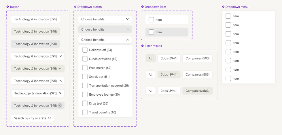
I created components for repetitive elements to help developers maintain consistency and streamline the implementation process.
Mobile versions of top filters


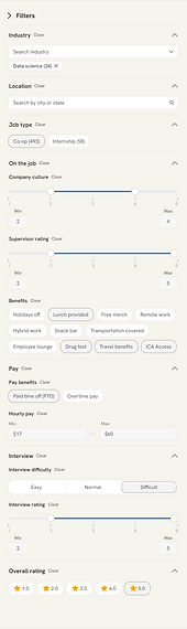
Filter Breakdown
See below for working prototype!
Users can search for a specific industry or location, and their selections appear as removable tags for easy adjustments.
The sliders were replaced with a click-based range selector, allowing users to choose their desired range. This interaction is more intuitive, as the hover state clearly indicates the selectable range and removes the need for dragging.
The hourly pay filter uses a text input, allowing users to enter their desired pay range. By default, it displays the lowest and highest pay values from the available jobs.

The toggle lets users switch between all listings, jobs, or companies to focus on the category they’re interested in.
The pill-style filters were replaced with checkboxes, as the pills extended across the filter bar and made the layout appear visually cluttered and overwhelming.
The benefits section now features a dropdown menu with checkboxes, allowing users to select multiple options from the tested benefit list.
The “Show Results” and “Clear All” buttons are sticky, remaining fixed at the bottom of the screen as users scroll for easy access.
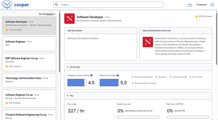
Improved Navigation and Search Flow
Navigation is now intuitive and efficient. Key filters sit at the top, while a clear toggle lets users view jobs, companies, or both. With an organized side panel, users can manage and filter through detailed criteria to find the exact co-ops they’re looking for.

Clear, Intuitive Filters
Navigation is now intuitive and efficient. Key filters sit at the top, while a clear toggle lets users view jobs, companies, or both. With an organized side panel, users can manage and filter through detailed criteria to find the exact co-ops they’re looking for.

Key Takeaways
1. Designing for visual hierarchy + information architecture
2. Refined understanding of search flow
3. Improvement in Figma skills
Overall, working on Cooper, and especially the filters, significantly expanded my design thinking. Instead of just focusing on creating a design solution, I learned to think deeply about who I was designing for and how to encourage users to actually engage with the filters I created. I also explored the full range of possibilities for this feature, including edge cases like how the interface should look when no results are found. Through this process, I strengthened my understanding of visual hierarchy and information architecture, refined the search flow to support clearer navigation, and improved my efficiency in Figma by using auto layout and reusable components under tight deadlines.