Reading Galaxy
Creating an engaging space for parents to track their child’s reading
With a team of three, I conducted stakeholder interviews, user research, and competitive analysis to define core user needs. I was responsible for branding Reading Galaxy (color palette, typography, logo) as well as designing and prototyping the statistics page where parents can access their child’s reading summary data through visualized charts. Using Figma, I made interactive components so parents can hover over the charts and see specific data.
UI/UX Desktop
Web Platform
UX Research
Timeline
July 2025 - August 2025
Role
UI/UX Designer, Researcher, User Tester
Tools
Figma
Client
Zeal Technology Solutions


Overview
Through the UX Design course in Northeastern's Seattle campus, our project was to solve the problem of limited visibility and communication between parents and their child’s reading progress and development. Our team of 4 worked together to design the web platform through Figma, focusing on iterations and usability.
Approach
Our mission was to create a user-centered platform that makes supporting their child’s reading progress more motivating for parents. Through multiple iterations and user testing and feedback, we produced a design solution, referencing usability design and lessons learned in class.
My Responsibilities
Design and prototype the Statistics Page
User Research and Usability Testing
Branding of Reading Galaxy (logo, color palette)
Team Members
Natali Lindenmeyer
Nora Harr
Alyssa Lin
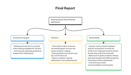
User Research
Our team conducted three user interviews: two with parents and one with a teacher. Using our interview notes, we organized insights into three categories: successful existing strategies, problems, and wants/needs.

I then made user personas to capture the needs and behaviors of our primary users.


Before moving to wireframes, I created a detailed sitemap for Reading Galaxy to define the information architecture and organize key features like the dashboard, stats, and teacher notes. This helped align the team and guide the overall design process.

Design Ideations
Wireframe Sketch
This is a wireframe sketch of how I initially envisioned the stats page to look like. Each icon on the left side would represent each stat section.

Low-fidelity wireframe
I added breadcrumbs for clearer navigation and designed buttons that allow users to switch between different statistics views.


Feedback
Peer Feedback:
All four peers who tested our prototype struggled to recognize that the stats at the top were clickable buttons rather than static text.
Client Feedback:
-
It isn't very clear what the share button in the stats button is for. What is meant by sharing? Export? Upload?
-
The stats buttons on the top don't specify the timeframe. Does it mean 214 minutes read in the week, month, or all time?
Revised Interface Changes
-
Instead of placing the stats buttons at the top, I made a reading summary overview that automatically displays total statistics.
-
The "last updated" label clarifies that the overview stats represent "all time" stats
-
I replaced the share button with an upload button and paired it with a recognizable icon
Medium-fidelity wireframe
I focused on streamlining the navigation process and added an initial stats overview page that displays total reading statistics and child profile, with a section at the bottom allowing parents to click into each category to view more detailed information.


Feedback
Peer Feedback:
Some peers had difficulty recognizing that each bar in the graph was clickable, noting that they didn’t expect a data visualization to be interactive.
Expert Feedback:
-
They recommended that a key usability principle is to minimize the number of clicks required, allowing users to access information efficiently without excessive navigation.
Revised Interface Changes
-
Refined the reading summary overview to clearly present the data (no slider)
-
Added a timeframe toggle for clarity
-
Integrated data visualizations directly into the main page to reduce the number of clicks and improve accessibility
Final Design and Flow
To improve my technical skills in Figma, I explored interactive components and hover interactions for the timeframe toggle and tooltips. The info tooltips show contextual details, such as which book was read and for how long, on specific days of the week.
Prototype Assumptions
-
Assumes user data (profiles, user progress, preferences) is stored securely and can be retrieved
-
Stores metadata about books (genre, Lexile level, etc.) and used across features


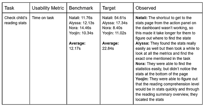
Usability Metric
My team and I conducted a usability metric to evaluate how easily users could interact with the platform and identify areas for improvement. This was the usability metric for the task of "checking the child's reading stats."
Key Takeaways and Next Steps
1. Learned the importance of usability testing and iterative design
2. Learned how to communicate effectively with users for interviews
3. Explored user research methods to better understand target users
Through this project, I learned the importance of usability testing and iterative design in creating intuitive user experiences. Each round of feedback showed how small adjustments can improve clarity and interaction with an interface. I also learned how to communicate effectively with users during testing sessions such as creating a comfortable environment and applying psychological principles by asking unbiased, non-leading questions. Additionally, exploring various user research methods to better understand our target users helped guide key design decisions for usability. As the only team member with a design background, I strengthened my technical skills by mentoring others in Figma, teaching features like auto layout and prototyping to bring our ideas to life.
Moving forward, I will continue refining my data visualizations to make them more straightforward and reduce the need for users to interpret the information.